Sunday, 6 October 2013

Tate Modern Visit

On our visit to the Tate Modern we were asked to write about a single themed room selected from the Tate Modern collection displays: 'Poetry and Dream', 'Structure and Clarity', 'Energy and Process', and 'Transformed Vision'.
 
First I went to 'Poetry and Dream' - Russian Revolutionary Posters (room 5). The room displayed street posters. the ideas and illusion conveyed in these posters are far from reality, however they reflect the history.


Then I went to Melanie Smith with was room 3 in this collection. She made a collaboration with filmmaker Rafael Ortega. In Smith's film, workmen carry a large mirror along the jungle paths and through the pools, reflecting and displacing the image of the garden.

I found this film quite interesting, however if I didn't read the information box, I would not have understand the film.


Then I went to the 'Structure and Clarity' collection to 'Minimalism' (room 9). In the late 1960's, many sculptors emphasised the process of making, and explored ideas of energy in their work. Artists began to use a range of everyday material.
 
I really liked this room as it displayed some architectural structures.


Then I went to see William Eggleston (room 10) in the 'Energy and Process' collection. Eggleston is known for his rich and complex images and is largely credited with establishing the acceptance of colour in fine art photography. Eggleston began to experiment with colour in the 1960's. During this period of time colour photography was only associated with commercial industries such as advertising and was considered unsuitable for fine art photography.
 
Eggleston mostly shoots in and around his hometown of Memphis Tennessee, as he depicts the everyday.
 
I really liked this room as I am highly interested in Photography. Eggleston's work relishes strong contrast in colour with vivid reds. blues and greens. I love the way each photograph captures a moment in his life.

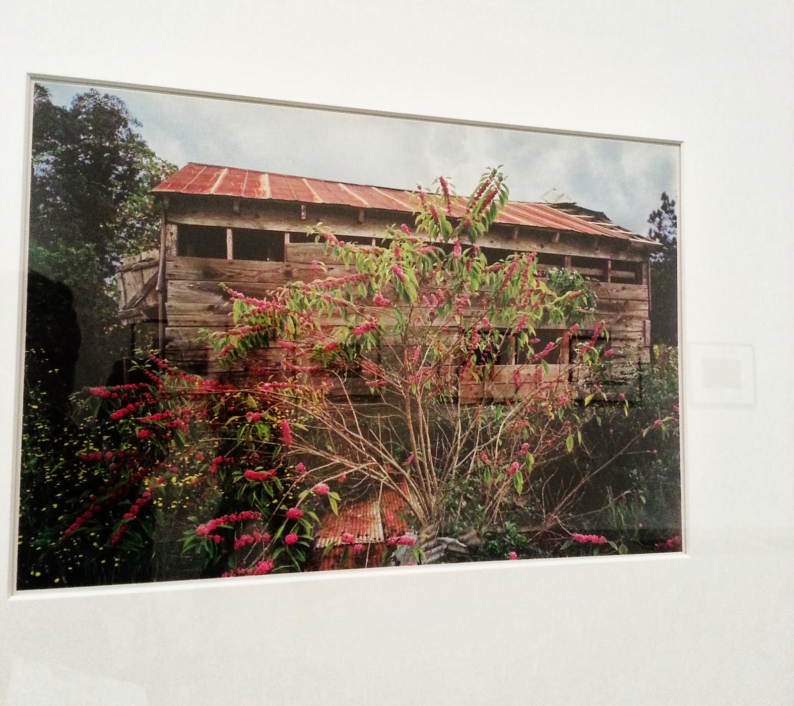
 
 
Still within this collection, I went to room 8; Homeworkers. The works in this room subvert materials traditionally associated with feminine craft. These work share an interest in textile production.

I love the work of Tracy Emin. The work displayed in this collection is 'Hate and Power Can be a Terrible Thing'. She made a quilt which includes two patches inscribed in the artists handwriting. Some of which refers to the Falklands War.

I and really interested in fashion and textiles and I am inspired by the unique work of Tracy Emin.


Another piece of work in this collection that really stood out to me is Margaret Harrison 'The Pikes'. This piece of work was influenced by Surrealism and the Fluxus movement. In this work she draws parallels between the potential cruelty of children's play and that of modern social and political structures.


The I went to see the 'Structure and Clarity', Ellsworth Kelly in room 10. For more that six decades, Ellsworth Kelly has focused on the basic visual elements of form, colour and scale. Many od Kelly's geometric abstractions are rooted in his close observation of the world, while others represent invented forms.
 
I think the works of Kelly is very simple but there's something about her work that attracts the viewer. Something so simple yet so brilliant!

 
Then I went to the 'Transformed Visions' collection in room 1. I fell in love with Thomas Hirschhorn's Candelabra with heads.


I decided to write my review on this Collection.

 
Gerhard Richter
 
Since the 1960s, Gerhard Richter has immersed himself in a rich and varied exploration of painting. I have always loved his work. He is an amazing artist.


Development

Today we have been focusing on way to develop our work on different creative software's. We have been looking at ways to develop our work using Photoshop, Illustrator and InDesign.
 
First we were asked to select an image of our choice. Then we were asked to insert it on Photoshop. I then removed the background of the image so that I was left with a silhouette of the figures. We were then asked to think of where we would like to be in ten years time.
 
I would like to be in Dubai in ten years time. I have an interest in travelling as it allows me to view different famous landmarks and architectural structures, also the experience of new cultures, new opinions, history, ideas, scenery and food.


I then applied some text onto the image. At this point, I felt like this image began to look like a postcard.

 
I then used Illustrator to create and design a logo. I used shapes and changed the colour many times until I was satisfied.


I then began to play around with text. I just wrote my name and played around with the anchor tool which allowed me to drag a point.


I designed five different logos. I feel that the logo below was the best one. So I began to look at different colours. I liked the black as it made it look simple but professional.


I then began to write about what I would like to do in 10 years time. I looked at different ways of involving the text within the image. As you can see from the image below I dragged the anchor tool around the outside of the building. This not only reflects and further emphasize what I would like to become in the future (Architect), but it draws the readers eye to it.

 
I enjoyed doing this task as it allowed me to used software's that I have never used before. I can use these software's in the future to further develop my designs and ideas.

Monday, 30 September 2013

Review - Tate Modern

The exhibition ‘Transformed Visions’ introduces artists who explore the erosion of the figure in the art of the 1940s and 1950s. The exhibition focuses on the tension between the physical and abstract in the art. Walking around this exhibition I found myself drawn to Thomas Hirschhorn’s ‘Candelabra with heads’. What simply looked like mannequins cocooned in brown packing tape, conveyed so much more as the faces of the mannequins seemed to be evolving.
In room one there was only two pieces of work; Hirschhorn’s ‘Candelabra with heads’ and Germaine Richier's 'Shepherd of the Landes’, which was displayed directly opposite from each other. Both works reveal harshly contrasting ways of presenting the human figure.
The sculpture worked well being in this room as it further emphasized the stiffness and restriction.

Thomas Hirschhorn is a Swiss artist who works and lives in Paris. Hirschhorn is known for his sculpture and installations with brown packing tape.

When carefully analysing his work I felt a sense of restriction as the mannequins were tightly compressed together with brown packing tape. This suggested a sense of ‘no freedom’; whether that be in society or his life, this piece leaves the observer’s speculating. It is important in this exhibition that you have an open mind when viewing the work because during this period of time living through many crises’ followed by the Second World War, artists were faced with the predicament of how to make art in the shadow of catastrophe.

Hirschhorn’s work is made up of everyday materials such as cardboard, paper and plastic bound with brown packing tape. I feel like his work combines more than one field of art and design. Despite the fact that the piece visually is a sculpture, you can see the combination within Fashion and textiles because of the material he uses and how he portrays it.

I see many connections within this piece of work that are similar to my interests. Especially the use of material. I enjoy exploring different ways and methods to portray the same idea. I think the use of brown packing tape makes this piece prominent.


Saturday, 28 September 2013

Photoshoot


I've been looking at designers such as Issey Miyake a Japanese fashion designer who has designed a collection of paper garments that expand from two-dimensional geometric shapes into structured shirts, skirts, pants and dresses.

Day 3 - Fashion and Textiles

On Day three of Fashion and Textiles we were asked to create one of our designs. I decided to make a head piece that I designed.
 
I was inspired by babies! I love the way Fashion has evolved and the way some fashion designers have used baby fashion from the past for women fashion now!


I think this specific garment looks cute but classy at the same time! This headpiece is made as a summer hat, so its used to protect you from the sun.
 
This head piece would be nice to wear with a dress or a skater skirt.