On our visit to the Tate Modern we were asked to write about a single themed room selected from the Tate Modern collection displays: 'Poetry and Dream', 'Structure and Clarity', 'Energy and Process', and 'Transformed Vision'.
First I went to 'Poetry and Dream' - Russian Revolutionary Posters (room 5). The room displayed street posters. the ideas and illusion conveyed in these posters are far from reality, however they reflect the history.
Then I went to Melanie Smith with was room 3 in this collection. She made a collaboration with filmmaker Rafael Ortega. In Smith's film, workmen carry a large mirror along the jungle paths and through the pools, reflecting and displacing the image of the garden.
I found this film quite interesting, however if I didn't read the information box, I would not have understand the film.
Then I went to the 'Structure and Clarity' collection to 'Minimalism' (room 9). In the late 1960's, many sculptors emphasised the process of making, and explored ideas of energy in their work. Artists began to use a range of everyday material.
I really liked this room as it displayed some architectural structures.
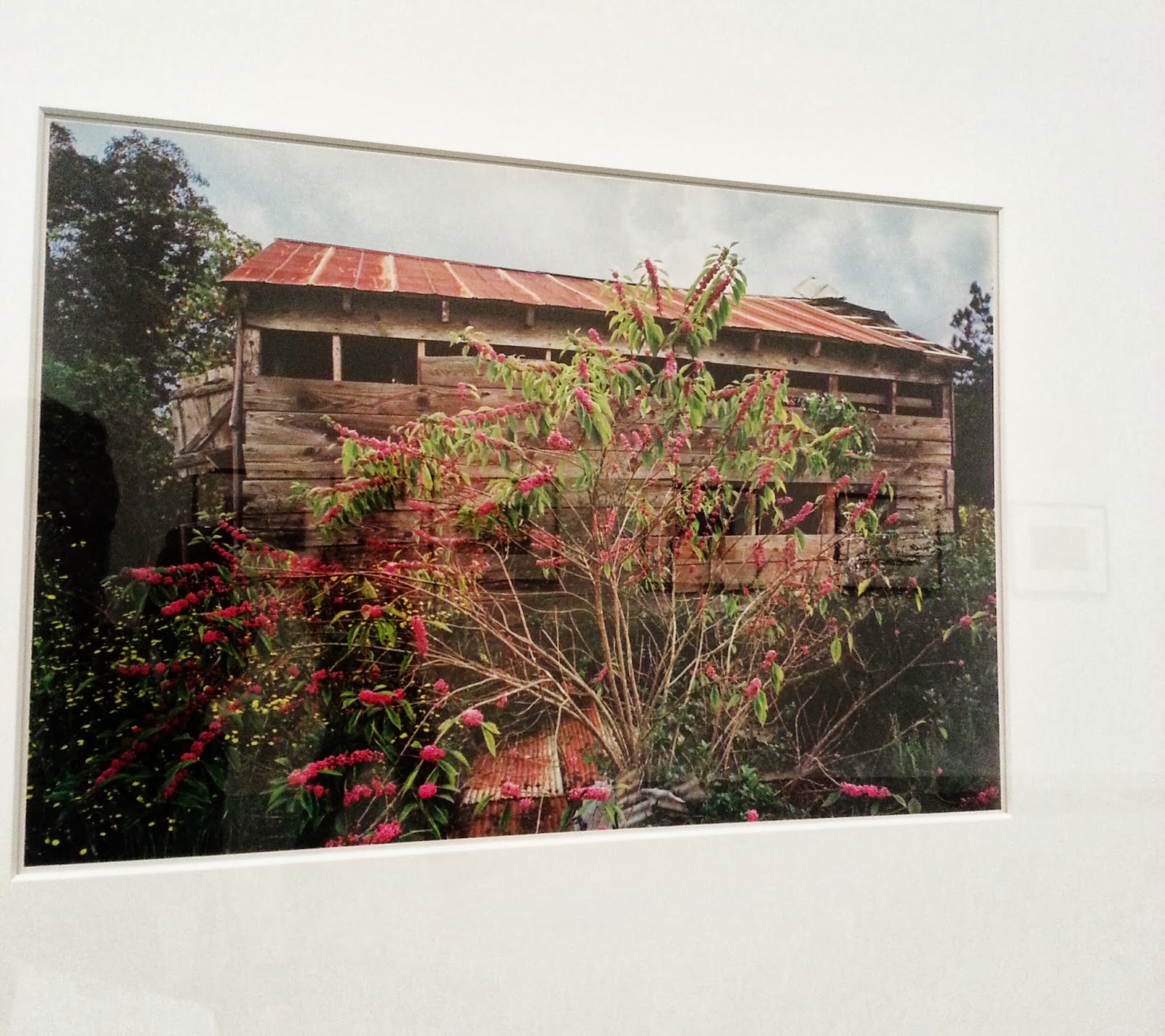
Then I went to see William Eggleston (room 10) in the 'Energy and Process' collection. Eggleston is known for his rich and complex images and is largely credited with establishing the acceptance of colour in fine art photography. Eggleston began to experiment with colour in the 1960's. During this period of time colour photography was only associated with commercial industries such as advertising and was considered unsuitable for fine art photography.
Eggleston mostly shoots in and around his hometown of Memphis Tennessee, as he depicts the everyday.
I really liked this room as I am highly interested in Photography. Eggleston's work relishes strong contrast in colour with vivid reds. blues and greens. I love the way each photograph captures a moment in his life.
Still within this collection, I went to room 8; Homeworkers. The works in this room subvert materials traditionally associated with feminine craft. These work share an interest in textile production.
I love the work of Tracy Emin. The work displayed in this collection is 'Hate and Power Can be a Terrible Thing'. She made a quilt which includes two patches inscribed in the artists handwriting. Some of which refers to the Falklands War.
I and really interested in fashion and textiles and I am inspired by the unique work of Tracy Emin.
Another piece of work in this collection that really stood out to me is Margaret Harrison 'The Pikes'. This piece of work was influenced by Surrealism and the Fluxus movement. In this work she draws parallels between the potential cruelty of children's play and that of modern social and political structures.
The I went to see the 'Structure and Clarity', Ellsworth Kelly in room 10. For more that six decades, Ellsworth Kelly has focused on the basic visual elements of form, colour and scale. Many od Kelly's geometric abstractions are rooted in his close observation of the world, while others represent invented forms.
I think the works of Kelly is very simple but there's something about her work that attracts the viewer. Something so simple yet so brilliant!
Then I went to the 'Transformed Visions' collection in room 1. I fell in love with Thomas Hirschhorn's Candelabra with heads.
I decided to write my review on this Collection.
Gerhard Richter
Since the 1960s, Gerhard Richter has immersed himself in a rich and varied exploration of painting. I have always loved his work. He is an amazing artist.


